How to Analyse, Gather, and Report on Your Healthcare Data Effectively
Tags:
📈 Harnessing Healthcare Data: A Guide to Improving Outcomes and Efficiency
In healthcare, the vast amounts of data generated daily have the potential to significantly improve patient outcomes, safety, and operational efficiency. However, achieving these benefits requires systematic data management, accurate analysis, and clear reporting.
Here’s a complete guide on how to effectively handle healthcare data from collection to KPI setting, making every data point count for a safer, more efficient healthcare environment.
Effective Data Analysis to Improve Patient Outcomes
Data alone cannot improve healthcare quality, but with proper analysis, it can highlight trends, predict risks, and offer actionable insights. Manually identifying trends can be tedious, costly, and prone to human error, which is where Radar Healthcare’s Risk, Quality and Compliance Software can help.
Automating data collection, storage, and reporting allows healthcare providers to focus on critical insights rather than manual data handling.
Here’s what you need for efficient data management in healthcare…
“One of the primary reasons we went with Radar Healthcare was the access to powerful analytics on top of the ability to create a really customised and simple approach to collecting our event data and our compliance data.”

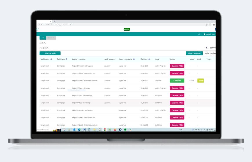
How to Gather Healthcare Data Efficiently
Efficient data collection is the foundation of accurate and actionable insights. Without reliable data, drawing meaningful conclusions becomes challenging.
Implement these best practices to streamline data gathering:
📊 Automate Data Collection: Use advanced tools to capture data consistently across sources, reducing errors and enhancing data accuracy.
✅ Ensure Data Quality: Verify the accuracy, integrity, and completeness of data, as high-quality data is essential for meaningful analysis.
📝 Standardise Data Entry Protocols: Implement standardised forms and formats for uniformity, simplifying data aggregation and interpretation.
📁 Centralise Data Storage: Store data in a unified, centralised system for accessibility, ensuring all teams have access to consistent data.
Radar Healthcare’s configurable tools support seamless data capture and integration, enabling healthcare organisations to consolidate data from multiple locations, departments and systems into one accessible platform. One Radar Healthcare Care Group Partner reduced their licensing costs by 65% after centralising their data system.
"Previously it took us 2 weeks to create reports, but now it takes just 2 minutes with Radar Healthcare."

How to Analyse Healthcare Data Effectively
Data analysis transforms raw information into insights, enabling healthcare providers to identify trends, predict patient needs, and make informed decisions. Follow these steps to improve your data analysis processes:
🎯 Identify Goals and Set Context: Define the purpose of the analysis, from patient outcomes to operational efficiencies, to align data insights with organisational goals.
🛠️ Choose the Right Tools and Techniques: Use tools like predictive modelling and statistical analysis to manage complex healthcare datasets.
🧹 Validate and Clean Data: Ensure data consistency by removing duplicates and addressing incomplete records for more reliable results.
🩺 Interpret Results with Clinical Context: Apply clinical expertise to contextualise findings and make data-driven decisions that enhance patient care.
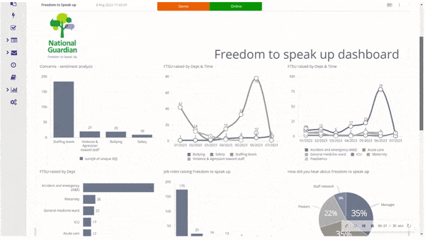
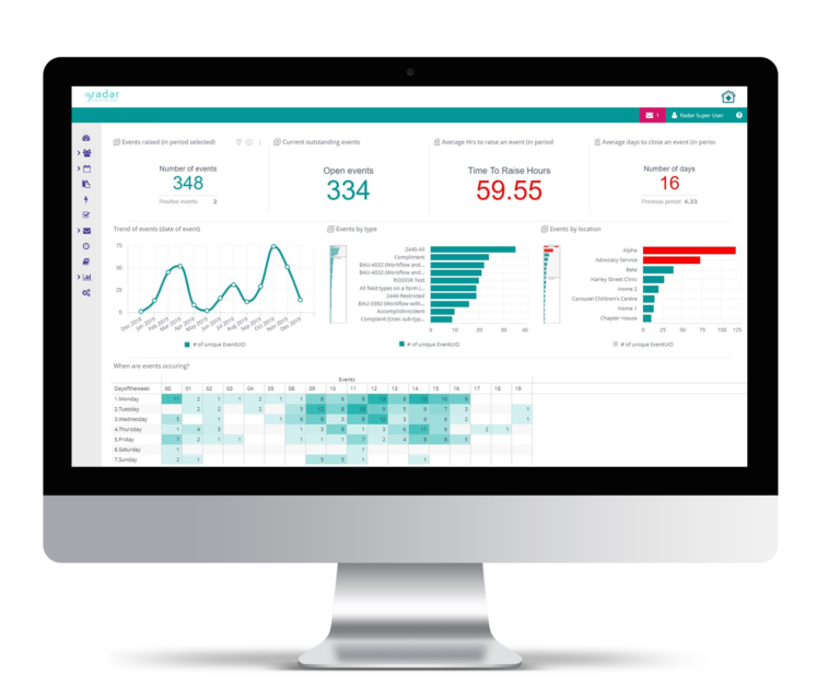
Radar Healthcare’s Analytics Module and dashboards make it easy for healthcare providers to spot trends, highlight anomalies, and address issues promptly. By automating data cleaning and providing real-time visualisations, Radar Healthcare enables teams to focus on action rather than data maintenance.
“One of the main drivers for transitioning to digital processes was the ability to be able to properly analyse data, spot trends, and then learn from this and make decisions based on the results. Without a solution that automatically manipulates data for you, reporting on what is working well and understanding what could do with improvement becomes difficult, very labour intensive, and potentially inaccurate.
Having one solution that centrally stores everything from our audits, incidents, events, improvement plans, and more, not only increases visibility, improves efficiency, and is financially savvy, but it frees up our operational staff’s time, allowing them more time to do their primary role of providing excellent care and support to our residents.”
Defining KPIs for Data-Driven Decision-Making
Key Performance Indicators (KPIs) are essential for measuring progress and ensuring that healthcare outcomes align with organisational goals. While KPIs are often revenue-focused, in healthcare, they also serve to track outcomes like reducing patient falls, improving medication accuracy, and ensuring timely responses to patient needs.
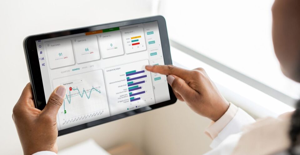
Radar Healthcare allows for custom KPI tracking, with real-time updates and dashboards tailored to each organisation’s unique metrics.
To set actionable KPIs, follow this four-step approach:
🎯 Align KPIs with Organisational Goals: Ensure KPIs reflect key patient, resident, and employee objectives, allowing your organisation to measure what matters most.
✅ Make KPIs Actionable: Set realistic, evidence-based KPIs that reflect achievable goals within your existing system.
📈 Focus on Outcomes: Use data insights to emphasise safety and prioritise learning from past experiences.
👥 Assign Ownership: Identify responsible teams or individuals for each KPI to foster accountability and drive a data-driven culture.
"Prior to diving into dashboards, it's crucial to gather key stakeholders and define the essential information required. Identify the high-level KPIs that matter most, then align these with the analytics to shape the dashboard's design. Essentially, it's about working backward to pinpoint actionable insights and craft the final outcome accordingly."
Interpreting and Learning from Healthcare Data
Beyond analysis, interpretation connects data trends to actionable improvements. It’s crucial in understanding how data impacts patient outcomes, resident care and operational efficiency.
Here’s how to approach data interpretation effectively:
🔍 Contextual Analysis: Relate findings to clinical or operational scenarios for relevant insights.
📊 Comparative Analysis: Compare current and historical data to identify trends or anomalies.
🎯 Focus on Outcome-Oriented Insights: Interpret data with a focus on improving patient outcomes and operations.
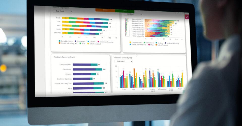
📈 Use Data Visualisation: Charts, dashboards, and visual tools make complex data more accessible and easier to act upon.
By using Radar Healthcare’s Pulse feature to set alerts for KPI thresholds, healthcare providers can easily monitor and address key indicators, from audit success rates to patient safety metrics. These visual tools enable organisations to make informed, timely decisions without wading through raw data.
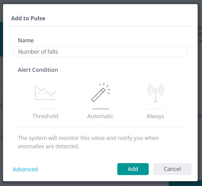
"My favourite bit of all of Radar Healthcare is the pulse functionality because not only can you start to look at your data sets in these custom dashboards that you've built, but then you've got the ability, per individual user, to set Pulse watches on them. For example, if there are any more instances of Falls in a certain location, you can set a pulse to notify you the minute there is fall recorded in that location. You can also create your own Pulse dashboard of all of the different things that you personally are really interested in looking at and you can make that your default. "
Reporting on Healthcare Data for Stakeholder Engagement
Effective reporting translates insights into actionable information for stakeholders, enabling them to make data-driven decisions.
Implement these best practices for impactful data reporting:
👥 Target Your Audience: Tailor reports to your audience, adjusting the level of detail for clinicians, executives, or external stakeholders.
📈 Use Clear Visuals: Present data using graphs and tables for at-a-glance comprehension.
⭐ Highlight Key Metrics: Focus on critical metrics such as patient outcomes, readmission rates, and efficiency benchmarks.
🚀 Provide Actionable Recommendations: Offer clear, data-backed recommendations to drive improvement.
Radar Healthcare’s Analytics Builder includes widgets and visualisation options that simplify data presentation, making it accessible for all stakeholders. Customisable dashboards allow organisations to provide clear, visual summaries of key metrics, saving time in report preparation and enhancing communication.
“One of the great things about the Builder Licence – and it sounds trivial – but it’s when you build the boards, and you can add a text widget that allows us to put context to the dashboards. This way, the people who aren’t analysts can look at these graphs and we can save them time by explaining what they mean, and it also gives them confidence in the data as well.”
Developing a Strong Data Culture in Healthcare
Establishing a robust data culture requires more than technology; it’s about instilling data literacy and accessibility across the organisation. Radar Healthcare supports this cultural shift by offering customisable modules and dashboards that make analytics easy to understand for all staff levels. As James Robson from Four Seasons Health Care noted, their custom dashboards save time and simplify data interpretation, making analytics accessible to non-analysts and reinforcing a data-driven approach to care.
Book a free demo