Healthcare Mapped

Healthcare Mapped: World Healthcare Systems Ranked
Healthcare systems differ globally, with some offering high-quality services for free while others can lead to significant medical bills. But does paying for healthcare guarantee better service, or are free systems just as reliable?
Here at Radar Healthcare, we are committed to supporting healthcare providers with our pioneering software that’s designed to save valuable time by automating arduous administrative tasks, as well as quality and compliance processes. Our goal is to give those working in the health industry time back to improve patient safety and overall healthcare systems, and we are also passionate about creating a culture of learning and improvement, rather than blame.
Which healthcare systems around the world are the best for patient care and costs?
With this in mind, we have taken a seed list of the 33 developed countries, and using the available information in each nation, have considered factors such as quality of healthcare, annual yearly salaries, number of hospitals, and the total number of healthcare costs per year.
These statistics have allowed us to determine our own ranking of the countries offering the best healthcare systems around the globe, allowing us to highlight how some simple improvements can really make a difference – and our results may just surprise you.
Ranked: the best healthcare systems around the world
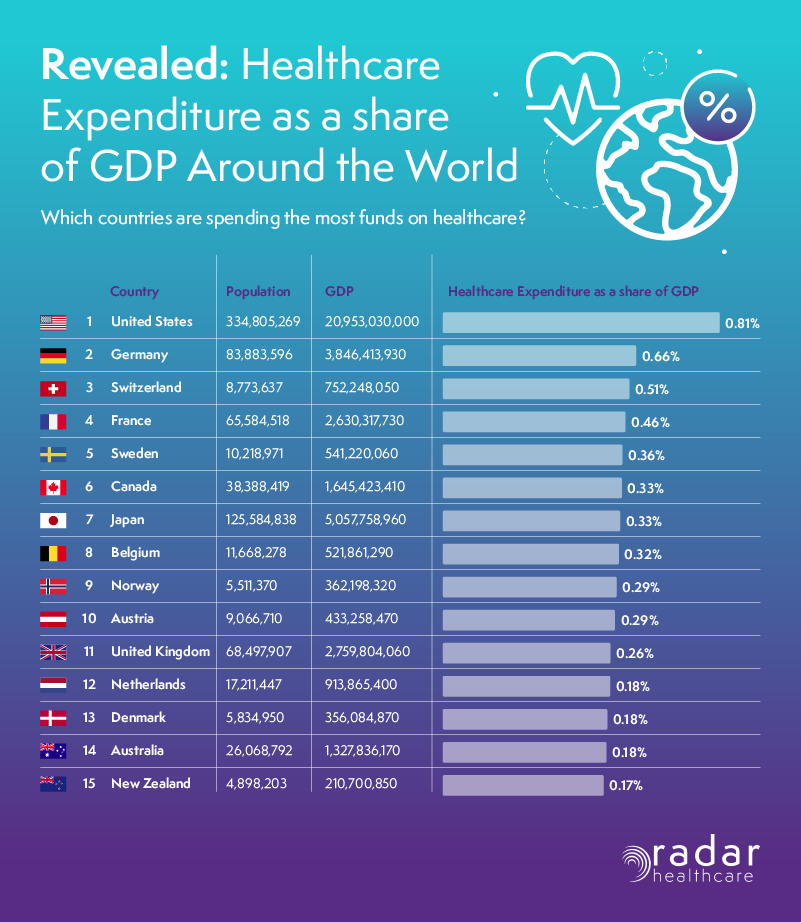
Which countries are spending the most on healthcare?
1. 🇯🇵 Japan: Japan scored 78.5/100 overall, with a high quality of healthcare rating (9.5/10). Despite its large population, the compulsory healthcare cost per person is relatively low at £3,725 annually.
2. 🇩🇪 Germany: Germany scored 73.5/100, excelling in human development (9/10) and voluntary healthcare costs (£796 per year), reflecting a well-rounded system.
3. 🇦🇺 Australia: Australia scored 71.5/100, with a notable human development score (8.5/10) and a balanced healthcare cost vs. salary ratio, where 3.15% of the average salary (£38,889.91) goes towards healthcare.
🇬🇧 Where did the UK place? The UK ranked 7th, with a commendable score of 69.5/100, considering its high population density and recent NHS challenges.
Revealing the best countries around the globe for quality of care
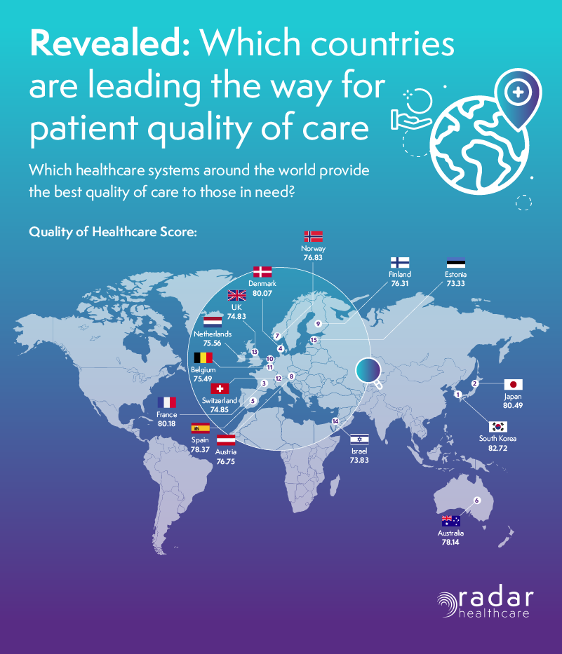
Which healthcare systems around the world provide the best quality of care?
1. 🇰🇷 South Korea: South Korea led in quality of care with a score of 82.72, boasting excellent hospital availability (4,133 hospitals for 51.3 million people).
2. 🇯🇵 Japan: Japan also excelled in quality of care with 80.49/100, supported by 8,300 hospitals and a high innovation ranking.
3. 🇫🇷 France: France scored 80.18 for quality of care, maintaining a good balance of healthcare costs and hospital numbers.
🇬🇧 Where did the UK place? The UK placed 13th in quality of care, scoring 74.83/100, outperforming Germany, New Zealand, and the USA.
Healthcare costs: revealing the most and least cost‑effective countries for healthcare
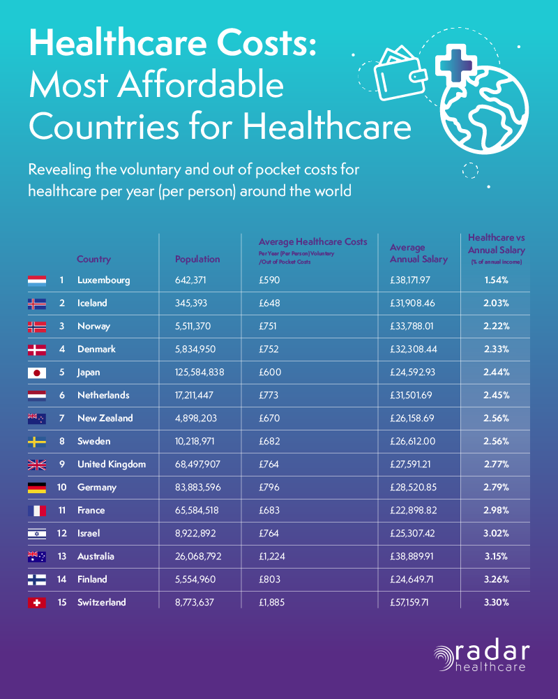
Revealing voluntary and out‑of‑pocket healthcare costs per year (per person)
1. 🇱🇺 Luxembourg: Luxembourg had the best cost-effectiveness, with healthcare costing only 1.54% of the average annual salary (£38,171.97).
2. 🇮🇸 Iceland: Iceland followed with healthcare costs at 2.03% of the average annual salary (£31,908.46).
The least cost‑effective countries for healthcare
🇬🇷 Greece: Greece had a disappointing cost-effectiveness of 9.83%, reflecting its ongoing economic struggles.
🇬🇧 Where did the UK place? The UK ranked 9th in cost-effectiveness, with 2.77% of the average salary (£27,591.21) spent on healthcare.
The countries with the most impressive hospital‑to‑population ratios worldwide
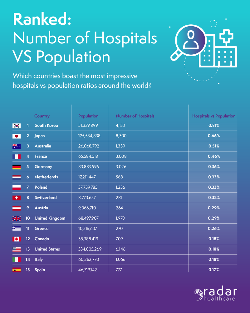
Which countries have the strongest hospital‑to‑population ratios?
1. 🇰🇷 South Korea: South Korea had the best hospital-to-population ratio, with 0.81% of the population catered by 4,133 hospitals.
2. 🇯🇵 Japan: Japan, with 8,300 hospitals for 125.6 million people, scored 0.66%.
3. 🇦🇺 Australia: Australia, with 1,339 hospitals for 26.1 million people, scored 0.51%.
🇬🇧 Where did the UK place? The UK, with a 0.29% ratio, highlighted the need for more hospitals to match its population.
Radar Healthcare perspective
There are numerous factors that impact the efficiency of healthcare systems across the globe, including financial and humanitarian crises, high population density, workforce pressures, and funding constraints.
However, the significant advances in healthcare technology seen over recent years are already having a positive effect on quality and safety, improving outcomes and enhancing the overall experience for patients. Learning from strong international healthcare systems — such as those in Japan — can help organisations that may be cautious about embracing rapidly evolving technologies. Ultimately, the most effective way to address ongoing global healthcare challenges is by sharing learning and best practice across borders.
In the UK specifically, there is clear opportunity to focus on upgrading and streamlining technological processes. For example, enabling compliance management and quality checks to be managed in a single, centralised system can help reduce complexity and administrative burden for healthcare teams.
Access to national health-related data also plays a vital role in driving learning and improvement. Initiatives such as LFPSE (Learn from patient safety events) aim to provide healthcare professionals with a more holistic view of national data — helping them understand what is working well and where improvements are needed across the UK.
At Radar Healthcare, the focus remains on reducing workload pressure for healthcare professionals by enabling smarter, more efficient ways of working. Equally important is fostering a culture that encourages learning and improvement rather than fear of blame or repercussions, as a blame culture is a significant barrier to progress in healthcare.